Since Excel 2010, a new and very interesting feature was added. Slicers. At first glance, they might seem like a beautified way to filter a pivot table, but they can be a lot more than that.
Practice FIle:
Transcript
In the current sheet, we can see a table along with a pivot table and a pivot chart based on it.
The pivot table has already been added to the data model.
Let’s add some slicers.
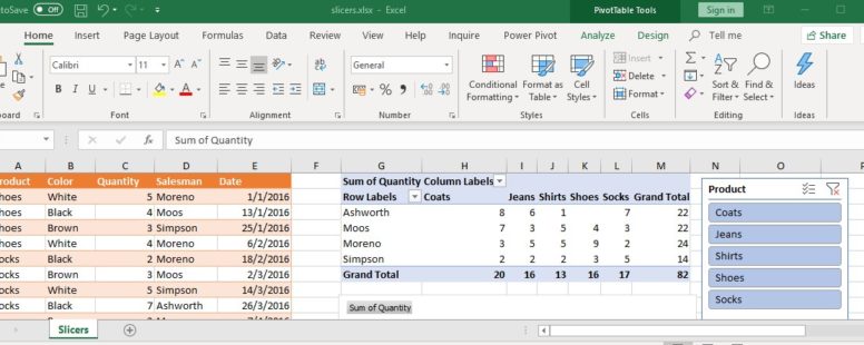
First, we click on either the pivot table or the pivot chart and select the “Analyze” tab on the ribbon.
There are two types of slicers. A general one suitable for all forms of data and the timeline, which was introduced in Excel 2013.
Let’s add a simple slicer for the product field and a timeline for the date field.
We can now use them to filter our pivot table and chart. We select to show only data for months April to August, and not to show data for shoes and socks.
There is an obvious advantage on the filtering provided by slicers over the built-in filtering of the pivot table.
We can instantly see the filters currently in effect.
The timeline slicer has a dropdown menu to choose how the dates are shown.
By clicking on the timeline, a new tab appears on the ribbon, named “Options”.
Clicking on it we have access to various commands. We can change the caption, and the style of the timeline, its size and alignment and we can even enable or disable various of its features.
But the button called “Report Connections” is probably the most interesting.
Before we click on it lets create one more pivot table based on our original table.
It will show the quantity of sales per color and per product. We will have to add this table to the data model as well.
Now let’s go to that button we talked about before.
By clicking on it we see a list on all the pivot tables currently on the data model.
The first Pivot table is already selected. By selecting the second as well, the slicer will be capable of filtering the two pivot tables simultaneously.
We repeat the process for our product slicer.
Notice how the tables and the chart change, by altering the slicers.
The general slicers are packed with some more features. We can access them via the slicer settings in the options tab.
There are options to sort the slicer data, to hide those with no associated information or to flag them. There is the option to change the caption, and the option to change the name.
In summary, the slicers are a very welcome addition to the Excel arsenal, and are here to stay and evolve.