Pivot tables might as well be Excel’s most powerful feature. A pivot table helps you to summarize and analyze your data, thus extracting the significant information from a large and detailed data set.
Practice File:
Transcript
For this example, we will use a rather small data set, to better understand the concept of pivot tables and how they work.
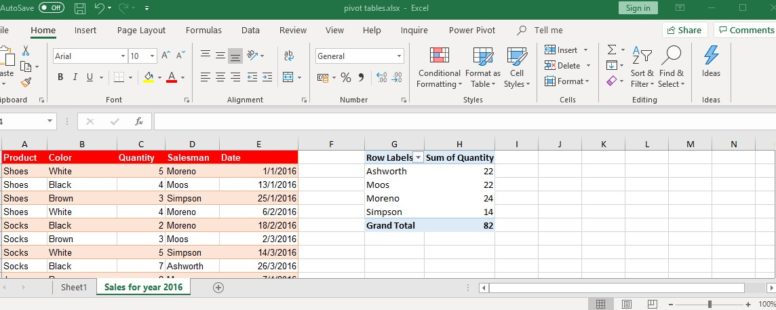
Suppose we want to review the sales per salesman. Excel provides a fast way to do that.
We click on the insert tab and then on the pivot table button. We select the cell range we want the pivot table for, if not already selected.
Finally, we decide if we want the table to appear on this sheet or on a new one. We choose this sheet for this example, and cell G1 specifically.
On the new window we can select the rows, the columns and the values of our table.
Since we want to review the sales per salesman, let’s put the salesman field on the rows area and the quantity on the values.
By default, the pivot table generator chose to show us the sum of quantity which is exactly what we need. But if we want we have many more choices.
There is an even faster way. On the insert tab of the ribbon and next to the Pivot Table button we have the recommended pivot tables button. By clicking on it Excel shows us a list of recommended pivot tables. Most of the times the pivot table we need can be found here.
A variation of the table we created exists here. Let’s click it and press ok.
A new sheet was created with the generated pivot table. This table has an extra field as row. The date field. This means that by clicking the plus sign beside the name of the salesman we can see the sales he did each day.
The versatility of the tool can be understood by adding one column to the mix. Let’s add the product field in the columns. In addition to all the previous information we can now see the sales per salesman, per date and per product.
Let’s play with it a bit more and add the color field to the filters.
This provides us with a filtering mechanism for our table.
We filter the results to show us the brown products only.
If we need to select more than one values for our filter we just click on this checkbox.
We can see that the same filter button exists on both the rows and columns.
By clicking on them we can further filter our results for certain salesmen or types of products. Let’s filter the results for salesman Simpson and for the product shoes.
So we now know that Simpson sold 3 brown shoes in total.
Imagine the time we would need to produce such analytical reports and summarizations by hand especially if we had a massive amount of data to analyze.
Impressive isn’t it. And this is just the tip of the iceberg. We have just begun to explore Excel’s capabilities in data analysis.